On anything but a bright white substrate, color accuracy in UV printing starts with the white layer underneath it — flood white for full opacity, spot white for selective translucency, and a double hit when one pass isn't enough to block the substrate.
Request a Quote →Because CMYK ink is semi-transparent, and printing it directly onto a dark, clear, or tinted substrate lets that substrate's color show through — the same way a thin coat of paint shows the wall behind it. A white ink layer printed first gives the color a consistent, opaque base to sit on, which is what makes the same file print the same color whether the part underneath is black ABS, clear acrylic, or raw plywood. Skip white where it's needed and the color isn't wrong exactly — it's just reading whatever's underneath it as much as the ink itself.
Flood white lays a solid opaque layer across the entire print area before CMYK goes down — the default when the whole graphic needs to read the same regardless of what's underneath. Spot white only prints under specific elements of the design, which is how a single file produces both fully opaque areas and translucent or frosted ones: skip white under a logo mark and light passes through it on backlit signage or privacy glass, while flood white under the rest of the graphic keeps it solid.
Print order matters too, and it flips depending on which side of the substrate is being viewed from. On a first-surface print, white goes down first and color prints on top of it. On a second-surface print — viewed through the substrate, like storefront glass — the order reverses: color prints first and white goes down last, sealing behind it as the backing layer. Getting this backwards is one of the most common defects in glass and acrylic jobs, covered in more depth on our UV printing on glass guide.
See Performance Data →
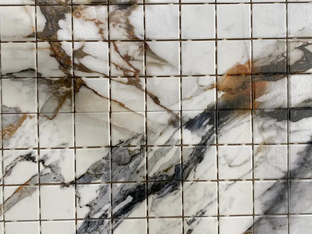
Substrate darkness and texture decide whether one pass of white ink is enough to fully block what's underneath it.
Every layer in the ink stack — white base included — is held to the same independently tested performance benchmarks that define all Polyprint applications.
EN ISO 16474-3 Atlas UV Test — zero surface change after 3000 hours of exposure.
EN 15184 pencil hardness test — rated 6H, the highest standard for coating hardness.
EN 438-2 ball impact testing — maximum machine rating with no visible damage.
DIN EN 14354 Taber Abraser — achieved classification 31 in tested conditions.
White ink lays down an opaque base under the CMYK colors so they read true instead of picking up the color of whatever is underneath — a dark, clear, tinted, or reflective substrate all distort color the same way a thin coat of paint shows the wall behind it. Without white, CMYK ink printed on anything but a bright white surface looks muddy, dark, or tinted toward the substrate color.
Flood white covers the entire print area solidly, giving every color on top the same opaque base — the standard choice when the whole graphic needs to read accurately regardless of substrate color. Spot white only prints under specific parts of the design, which is how backlit signage and frosted-privacy glass effects get built from the same file.
A single pass can be thin enough that dark or heavily tinted substrates still show through faintly, especially on deep colors like black ABS or dark-stained wood. A double hit — white, cured, then a second white layer before color — builds enough opaque coverage to fully block the substrate. It adds a cure cycle and cost, so it's specified only where a single pass tests as insufficient.
Yes, directly — the white layer is what a color profile is built on top of. Uneven white coverage, whether from a worn printhead nozzle, incorrect flood density, or a skipped double hit, shows up as visible blotching or color drift across an otherwise identical print.
Clear substrates (glass, acrylic), dark or black substrates, natural wood, unbleached cardboard, and anything with visible grain or texture generally need white. Bright white substrates usually don't, since the base is already close to what the profile assumes. Ask us about your specific substrate.
Send us your substrate and artwork. We'll tell you whether it needs a white underbase, a double hit, or nothing at all — and quote it accordingly.