Danger, warning, caution and notice signs have to say the right thing in the right colors, at a size people can read before they reach the hazard. Here’s what OSHA and ANSI Z535.2 actually specify, and how we UV print custom safety signs that follow them.
Request a Quote →In the U.S., workplace safety signs answer to OSHA, and OSHA’s sign rules point to the ANSI Z535 standards for colors and layout. Under 29 CFR 1910.145 (general industry), danger signs use red, black and white; caution signs use a yellow background with black lettering; and safety instruction signs use a white background with a green panel. For construction, 29 CFR 1926.200 allows signs that follow either the old ANSI Z35.1-1968 figures or ANSI Z535.2-2011, the current format with a DANGER, WARNING, CAUTION or NOTICE header in specified safety colors. UV printing fits this work well: it prints the full safety-color palette, small type and pictograms directly onto rigid aluminum, plastic and composite blanks, and it makes short, site-specific or bilingual runs practical. What the printer can’t do is decide the hazard level. That call, and the wording, belong to the employer.
OSHA’s general industry standard, 29 CFR 1910.145, covers signs intended to warn of hazards that could injure workers or the public, except street, highway and railroad signs. It also says something buyers often miss: all new signs and replacements of old signs must meet its specifications. A reorder of an old sign is a chance to bring it up to date, not a reason to copy a design that no longer complies.
The standard sorts signs by use. Danger signs are for immediate danger where special precautions are needed. Caution signs are only for potential hazards or unsafe practices. Safety instruction signs carry general safety instructions. It also has a physical requirement that matters to a sign fabricator: every sign must have rounded or blunt corners and be free of sharp edges, burrs, splinters or other sharp projections, with fastener heads placed so they don’t create a hazard. And it asks that wording be easy to read, concise, positive rather than negative where possible, and accurate in fact.
For color, 1910.145 refers to the opaque glossy samples in ANSI Z53.1-1967 or ANSI Z535.1-2006(R2011). In other words, “red” on a danger sign is not whatever red the artwork happens to contain. It is a defined safety color.
Quote a Safety Sign Run →
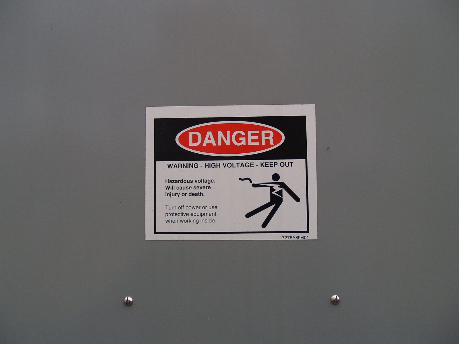
An older-format danger label (red oval header) on an outdoor electrical panel. ANSI Z535.2 dropped this header style as of its 2002 edition in favor of the simpler signal-word panel. Not a Polyprint project. Photo: The Navigators, Wikimedia Commons, CC0.
ANSI Z535.2 is the American National Standard for environmental and facility safety signs, and OSHA’s construction standard incorporates its 2011 edition by reference. The 2011 edition was reaffirmed in 2017. Its definitions and color assignments are the core of any compliant layout:
| Signal word | What it means (Z535.2-2011) | Signal word panel | Safety alert symbol |
|---|---|---|---|
| DANGER | A hazardous situation that, if not avoided, will result in death or serious injury. Limited to the most extreme situations. | Safety white letters on safety red | Used |
| WARNING | A hazardous situation that, if not avoided, could result in death or serious injury. | Safety black letters on safety orange | Used |
| CAUTION | A hazardous situation that, if not avoided, could result in minor or moderate injury. | Safety black letters on safety yellow | Used |
| NOTICE | Important information that is not hazard-related, such as property damage, security, sanitation and housekeeping rules. | Italic safety white letters on safety blue | Not used |
| SAFETY INSTRUCTIONS (or a specific heading such as LOCKOUT PROCEDURE) | Specific safety-related instructions or procedures. | Safety white letters on safety green | Not used |
A few layout rules from the same standard affect the artwork directly:
Z535.2 also says lettering must be readable by a person with normal or corrected vision at a safe viewing distance, one that allows a reasonable reaction time to avoid the hazard. That is why letter size is a decision about the hazard and the room, not just about how big the blank is.
Walk any older plant and you’ll see two families of sign. The older one, from the ANSI Z35 era, puts DANGER in white letters inside a red oval on a black band, like the label in the photo above. The newer one uses a simple rectangular header with the safety alert symbol and the signal word, plus a dedicated orange WARNING level.
The foreword to Z535.2-2011 explains the shift: the 1998 edition stated a preference for the simpler header and a white message background for contrast, and as of the 2002 edition the older format was no longer included. The 2007 edition began moving property-damage messages from CAUTION to NOTICE, and the 2011 edition completed that phase-out.
OSHA’s construction rule still allows either the 1968 figures or Z535.2-2011, so an older-style sign is not automatically a violation there. But mixing both styles in one facility makes hazard levels harder to read at a glance. When you replace signs, it’s worth standardizing on one system across the site, and the current Z535 layout is the one the standard itself now specifies.
Stock safety signs from a catalog are fine for “Hard Hat Area.” They are less helpful when the message has to name a specific machine, a specific chemical, a lockout point, a voltage, or a procedure in two languages. Direct UV printing is built for that kind of work:
UV printing is not the right answer for everything. Road and traffic-control signs follow the MUTCD, which OSHA’s construction standard points to for traffic control, and they typically need certified retroreflective sheeting. Exit signs are governed by building and fire codes as well as OSHA. We’ll tell you when a job belongs on a different process.
Send your hazard list, wording, languages, sizes, quantities and where the signs will hang. We’ll lay them out to the Z535 format you specify, proof them on your substrate and quote the run.
Z535.2 says safety colors must conform to ANSI Z535.1, and ANSI publishes a separate Z535 color chart that, according to the standard’s foreword, describes each safety color’s ink formulation and closest PANTONE color. The foreword also warns that colors printed in the standard itself may not be accurate because of differences in printing technology. For a print buyer, the practical step is to specify the Z535 safety colors by name on the order and approve a physical proof on the actual substrate under the lighting where the sign will hang. Our color matching and Pantone guide explains how we match spot colors on different materials.
The standard requires durable materials and a reasonable expected life with good color stability and legibility, taking the environment of use into account. It also calls for periodic inspection and cleaning, and replacement once a sign can no longer be read from a safe viewing distance. Outdoors, sunlight fades color over time, so inks and protection need to be chosen for the exposure. Indoors, chemicals, lubricants and abrasion are the usual enemies. A protective laminate or clear coat, matched to the cleaning chemicals on site, extends service life; our UV print durability guide covers how long prints last and how to care for them.
Z535.2 says hazard signs must be placed so people are alerted from a safe viewing distance, must not be hazards themselves, and must not be blocked by doors, windows, racks or gates or removed by the motion of the hazard they warn about. Where lighting can fail, it suggests photoluminescent or retroreflective materials or emergency lighting. Tell us about mounting surfaces and lighting up front, since they can change the substrate, finish (gloss vs. matte to limit glare) and hole placement.
Room identification signs at permanent rooms and spaces fall under the ADA Standards, with tactile characters, Braille and mounting rules of their own. That is a different rulebook from OSHA and Z535. If a project includes both, we quote them as separate sign families; see UV printing and ADA signage compliance.
OSHA’s rules incorporate ANSI standards by reference. For general industry, 29 CFR 1910.145 specifies danger, caution and safety instruction sign colors by reference to ANSI Z53.1-1967 or ANSI Z535.1-2006(R2011). For construction, 29 CFR 1926.200 lets employers follow either ANSI Z35.1-1968 or ANSI Z535.2-2011 for danger and caution signs.
Under ANSI Z535.2-2011, DANGER means a hazard that will result in death or serious injury if not avoided, WARNING means one that could result in death or serious injury, and CAUTION means one that could result in minor or moderate injury. DANGER uses white on red, WARNING black on orange and CAUTION black on yellow.
When the message isn’t about personal injury. ANSI Z535.2-2011 uses NOTICE, in italic white letters on blue and without the safety alert symbol, for property damage, security, sanitation and housekeeping messages. The use of CAUTION for those messages was phased out in the 2011 edition.
Yes, the print method isn’t what OSHA regulates. Compliance comes from the sign’s classification, colors, layout, wording, legibility, durability and placement. UV printing can reproduce Z535 layouts on durable rigid substrates; the employer remains responsible for choosing the hazard level and message.
Under 29 CFR 1910.145(d)(1), all signs must have rounded or blunt corners and be free of sharp edges, burrs, splinters or other sharp projections, and bolt or fastener heads must not create a hazard. Specify the corner radius when you order metal or rigid plastic signs.
Sources: 29 CFR 1910.145, Specifications for accident prevention signs and tags (OSHA); 29 CFR 1926.200, Accident prevention signs and tags (OSHA); ANSI Z535.2-2011 (R2017), American National Standard for Environmental and Facility Safety Signs, as incorporated by reference (public copy at law.resource.org). This page is general information, not legal or safety-compliance advice; your safety professional should confirm hazard levels and wording.
Send the hazard list, wording, languages, sizes and environment. We’ll proof the layouts on your substrate and quote the full run, including replacements for older-format signs.